Project Overview
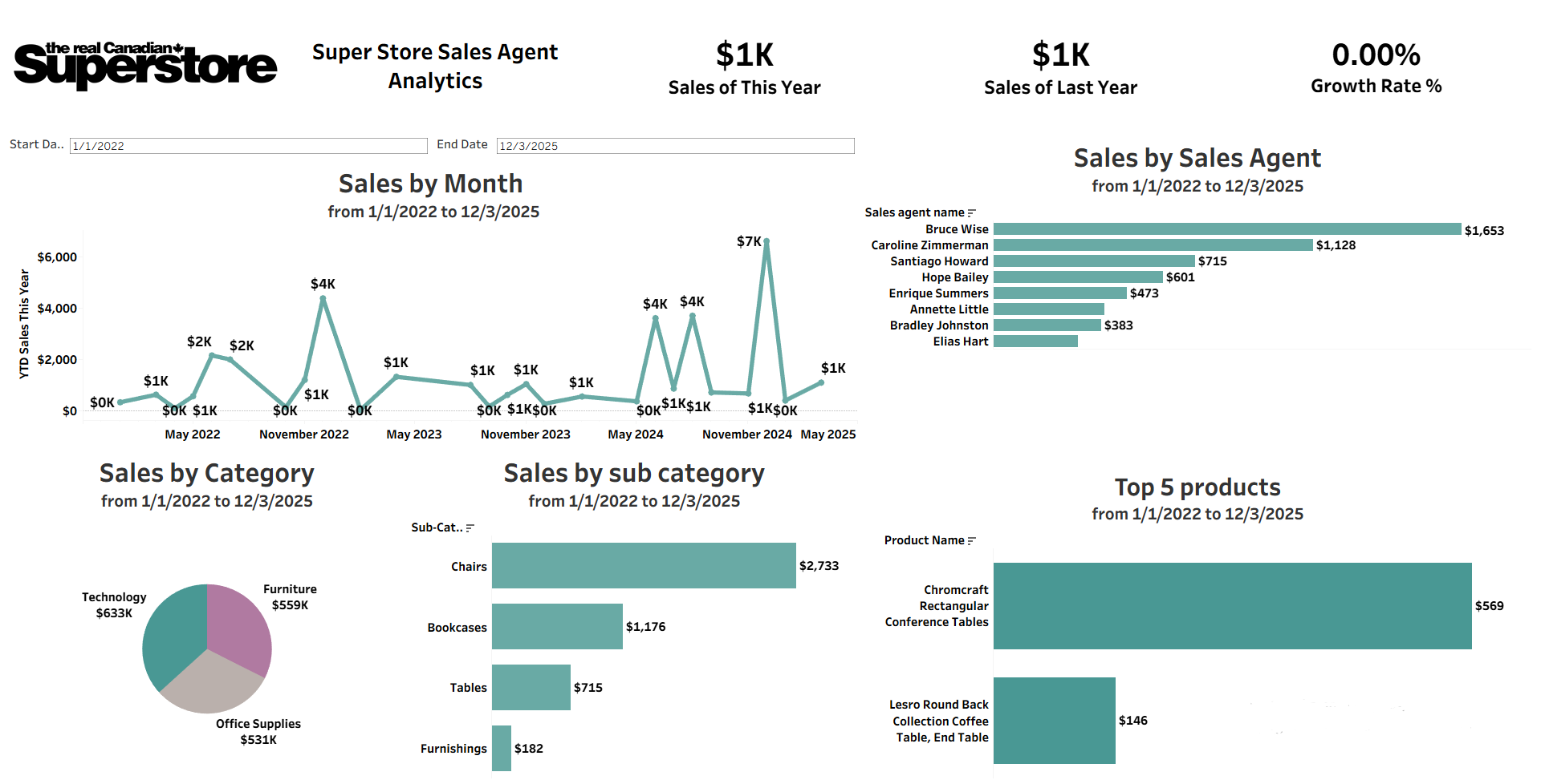
The dashboard uses a combination of KPI cards, line charts, bar charts, and a pie chart to present sales performance in a clear and interactive format.
These visualizations make it easier to track monthly sales activity, compare sales agents, analyze category and sub-category performance, and identify top-performing products.
By structuring the data into simple visual components, the dashboard enables users to explore trends quickly, evaluate performance more effectively, and support better sales-related decision-making.